Tony Fan

hero-img
DeliveryFreeReturn
grocery delivery app
Mainly supply local restaurant where in
TorontoandMontreal
BACKGROUND AND CONTEXT
FoodsUp, a restaurant supply chain company, offers online grocery sales and delivery services in Ontario and Quebec, partnering with 8,500 restaurants and providing over 8,000 products.
The original version of mobile app no longer aligns with customer expectation and marketing team’s sales strategy, this led to the decision to redesign the app and aim to improve product sales rate and user retentions
The Team
Product Manager
UX/UI Designer
Backend Developer
Frontend Developer
QA Tester
My role
I’m a lead ux/ui designer in this project and work closely with PM, co-designer and developers.
Responsibility
My main responsibilities include conducting user research, ideating, designing wireframes and prototypes, and creating Design system, logo animation and illustrations.
Timeline
16 weeks for the MVP of the product
Understand what our customers and stakeholders were saying
We send online surveys to our customers and stakeholders to gather feedback, helping us improve our services and address any concerns.
Customers
comma
I was going to buy more, but I couldn't find any discounts
avatar
Mohammad Jethwa
comma
Why is there only one way to log in ?
avatar
David Kim
comma
I don’t want spend long time on product purchasing
avatar
Allen Hong
Stakholders
comma
We need to increase sales through effective promotions
Marketing
comma
Improving conversion rates is critical
Marketing
comma
Customer always complain about return policy
Customer service
Create “How Might We” Statement
These statements help us brainstorm creative solutions, stay focused on user needs, foster collaboration among team members, and guide iterative improvement based on research and testing.
How might we streamline the product purchasing process to minimize user time investment?
How might we implement effective promotions to drive sales growth?
How might we optimize conversion rates across all user interactions?
How might we redesign our return policy to reduce customer complaints and enhance satisfaction?
How might we enhance discount visibility to encourage increased purchases?
Define goals before research
After discussion with Marketing and customer service team. We established few design goals.
icon_userengagement
Enhance User Experience and Engagement
  • Improve discount visibility and accessibility to encourage increased purchases.
  • Implement multiple convenient login options to enhance accessibility and user satisfaction.
  • Streamline the product purchasing process to minimize user time investment and friction.
icon_goalcustomer
Improve Customer Satisfaction and Loyalty
  • Redesign the return policy to reduce customer complaints and improve satisfaction.
  • Continuously monitor and refine the return process to ensure a positive experience.
  • Implement changes based on user feedback to enhance overall satisfaction and loyalty.
icon_promotion
Drive Sales Growth Through Effective Promotions
  • Develop and implement effective promotional strategies to drive sales growth.
  • Optimize conversion rates across all user interactions to maximize sales opportunities.
Empathizing through user interview
We decided to kick off the project with a discovery interview session to understand their expectations regarding loyalty, promotion, and engagement, as well as what provides emotional delight to them within the experience.
We spoke to 5 active users via Zoom
Our primary research questions
How do users currently discover discounts and promotions on our app?
What login methods do they prefer and why?
What steps in the purchasing process do users find most time-consuming?
What types of promotions motivate users to make a purchase?
At what points in user journey do they typically abandon the cart?
What aspects of our current return policy do users find most problematic?
Synthesize and prioritizing insights
Through user interviews, we gathered valuable insights from participants, revealing several key priorities that our solution must address.
Unclear discount notification
Many users discover discounts and promotions through banner ads on the homepage, but find them sometimes unclear or not specific to their needs.
Limited login method
Participants prefer social media logins for convenience but encounter connectivity issues and privacy concerns.
Complex checkout process
Cart abandonment often occurs due to unexpected fees during checkout or a complex checkout process.
Automatic Discount Incentives
Users are motivated by percentage-off discounts and buy-one-get-one-free deals, especially when applied automatically at checkout.
Cumbersome return process
Users must contact customer service to initiate a return request and often face long wait times for a response.
Identifying design solutions
we assess the technical feasibility and potential impact of each design solution, considering factors like development resources and timeline constraints. Finally, we validate our prioritization with stakeholders, ensuring consensus and alignment before moving forward with implementation.
Improve_login
Improve Social Login Integration
Provide users with convenient and secure login options, improving accessibility and overall user satisfaction.
Checkout_process
Simplify Checkout Process
Make the purchasing process faster and more user-friendly.
visibility_relevance
Enhance Discount Visibility and Relevance
Make discount and promotions easier for users to discover appealing promotions, thereby encouraging increased purchases.
streamlined_promotion
Streamline Promotional Application
Simplify the checkout process and incentivize purchases, ultimately increasing conversion rates.
return_policy
Clarify and Streamline Return Policy
Provide the straightforward and transparent return process, enhancing overall user experience and loyalty.
Getting started with the design
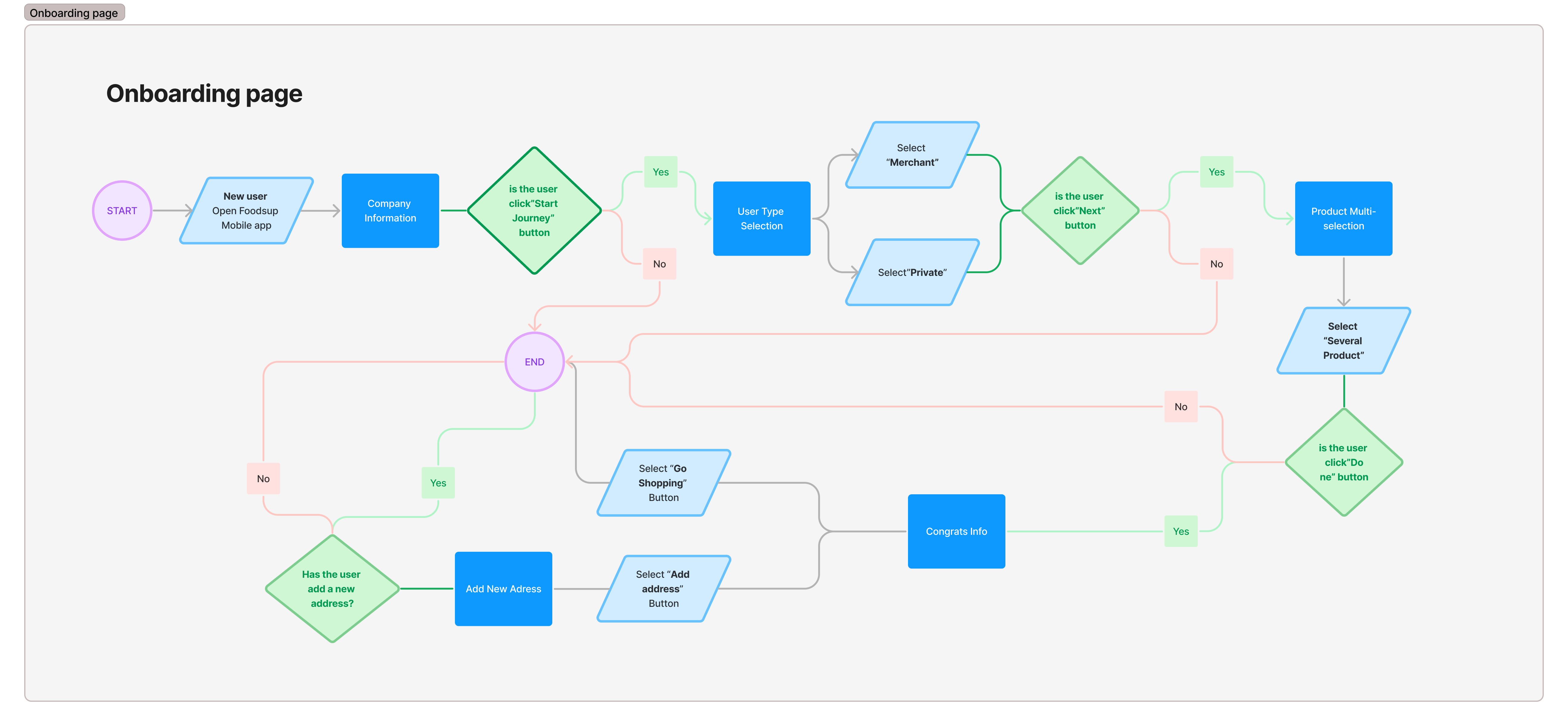
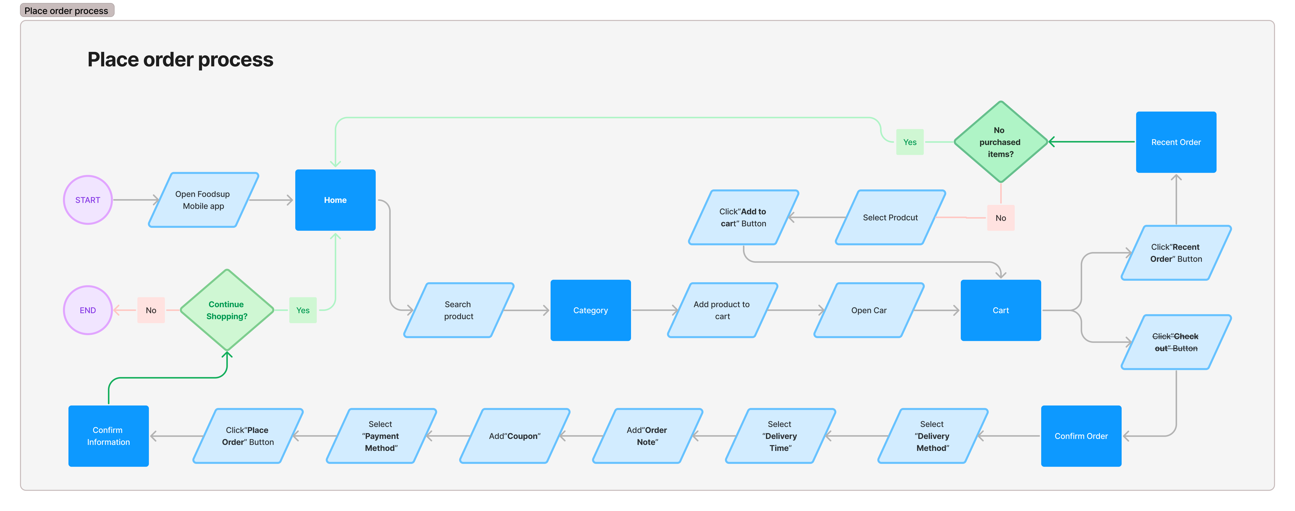
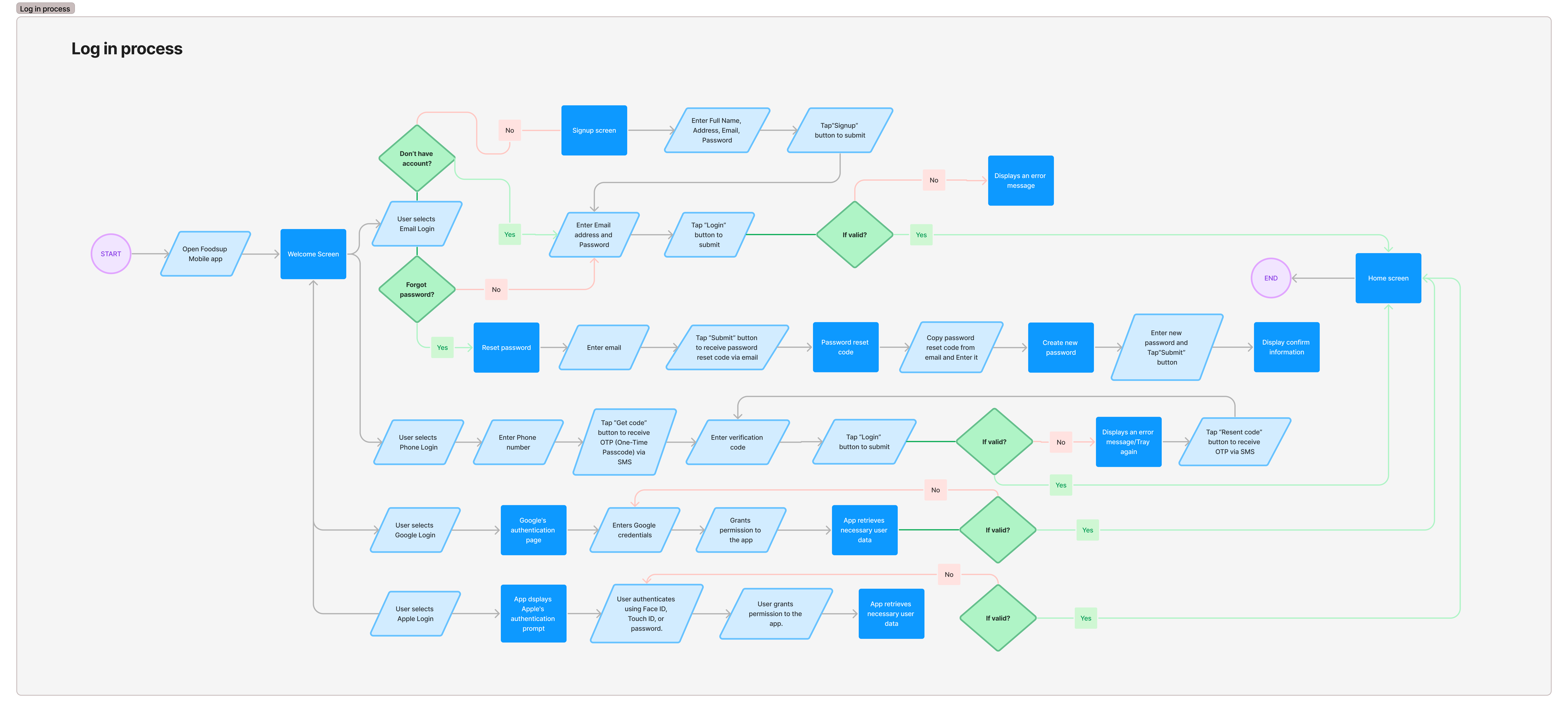
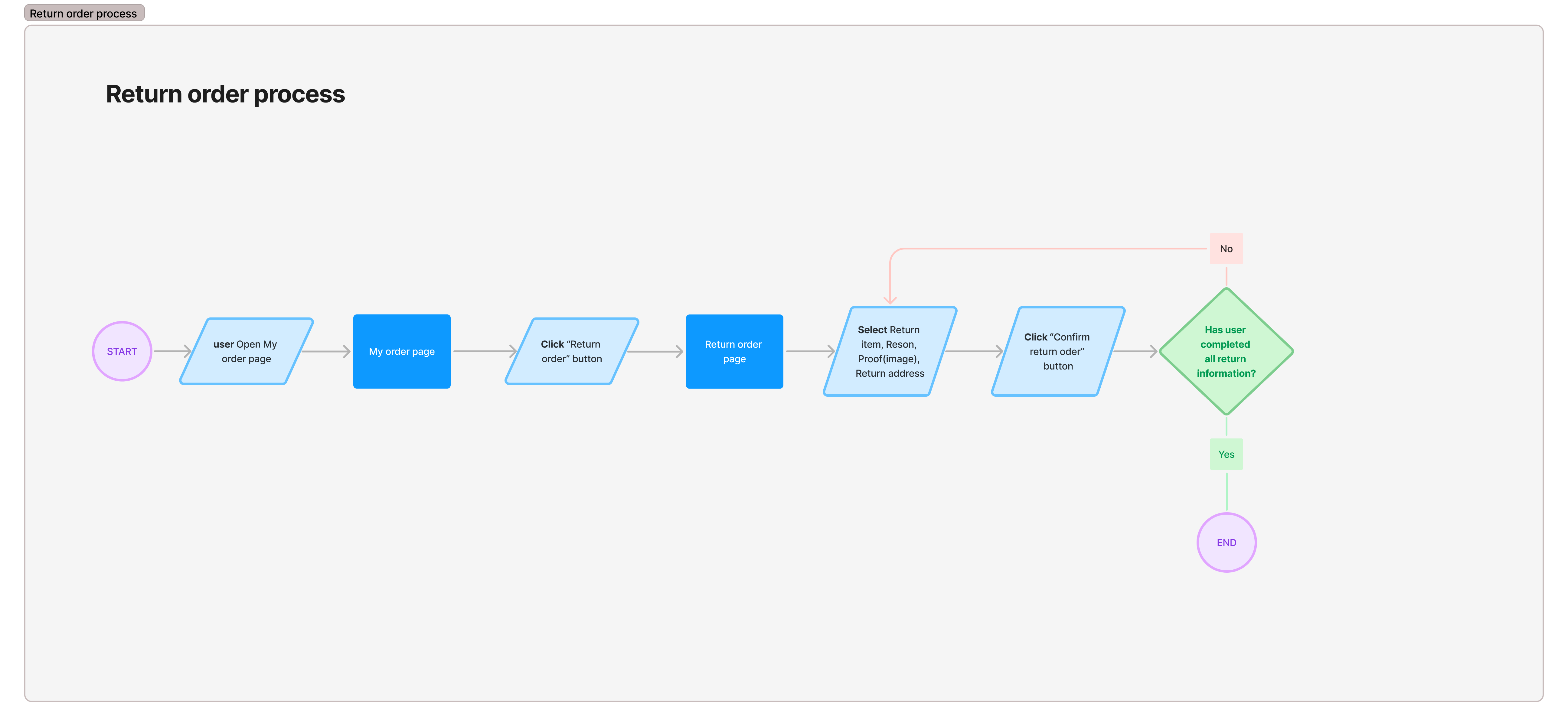
I let the design process starting with drafting early user flow and wireframes which I used to gather feedback from other designer as well as key stakeholders involved in the project.
onboarding_page
place_order
login_process
return_order
I created low-fidelity version first for user testing, then develop high-fidelity mockup as soon as I got the feedback from users and I invited few participants from the user interview to go through the wireframes.
The test went smoothly, all of them successfully completed the tasks. Problems of the first version of the wireframe reminded me to put myself into the user’s shoes. Empathy was not that easy as I thought it would be.
wireframe_placeorder
Recommendations from testers
  • Vertical display items take up too much space on Confirm order screen, it should be shorter.
  • Consider adding “Recent order” function on shopping cart screen after user successfully purchased order
  • Adding "Drop-off options" in Delivery section of the Confirm Order screen allows users to quickly leave messages for the delivery driver.
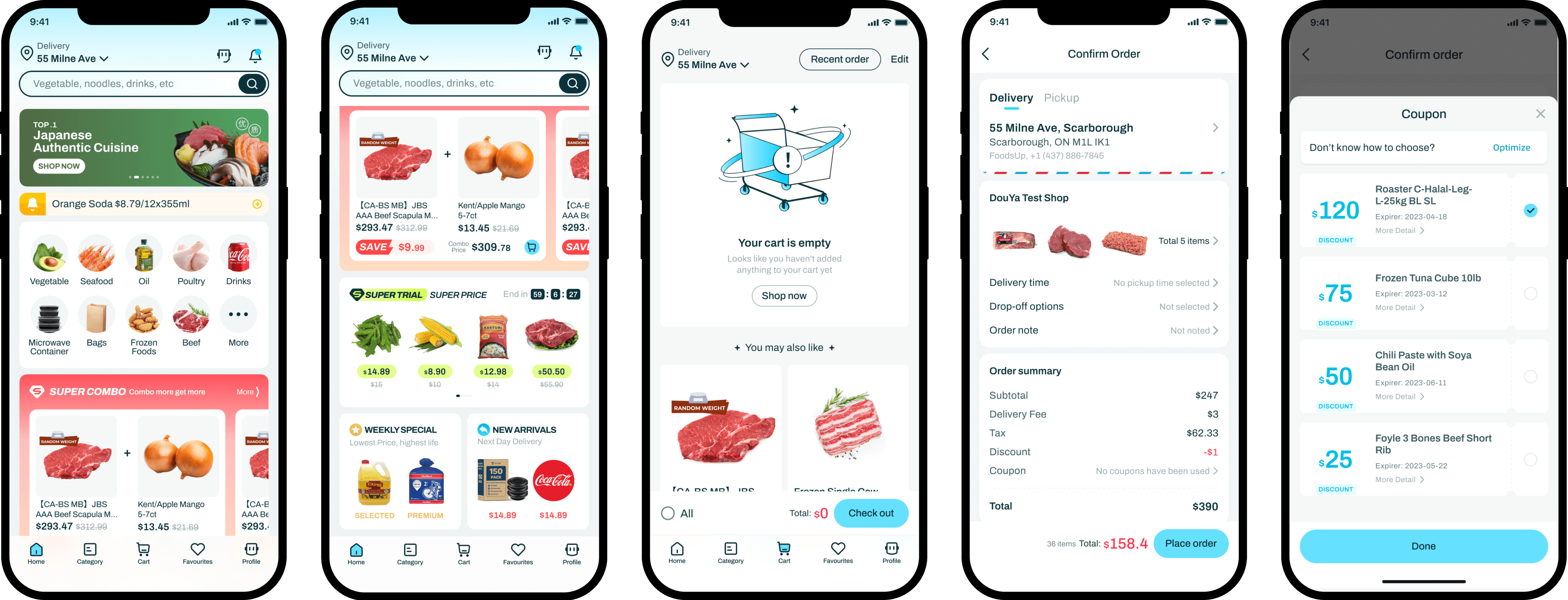
Prototypes before usability testing
first_prototype
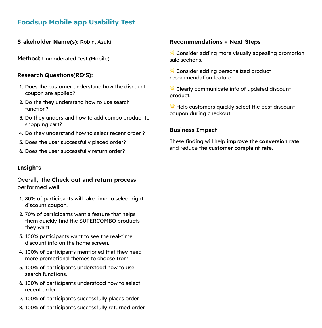
Usability testing results and feedback
During the second round of prototype evaluations, we conducted tests using a click-through, high-fidelity prototype. The primary focus was on evaluating how effectively users could complete specific tasks.
Afterward, we asked follow-up questions to understand any challenges they faced, particularly around task difficulty and instances where their expectations did not align with the experience.
This process provided critical insights into areas where the design might need adjustment.
usability_test
Recommendations
  • Consider adding more visually appealing promotions sale sections.
  • Consider adding personalized product recommendation feature.
  • Clearly communicate info of updated discount product.
  • Help customers quickly select the best discount coupon during checkout.
Iterations based on feedback
After usability tests, we gather user feedback to identify areas of confusion. We prioritize these issues and make targeted improvements to the prototype, such as simplifying purchasing experience or enhancing visuals.
The updated prototype is then tested again to see if the changes resolve the issues. This cycle repeats until the design meets user expectations, resulting in a more user-friendly final product.
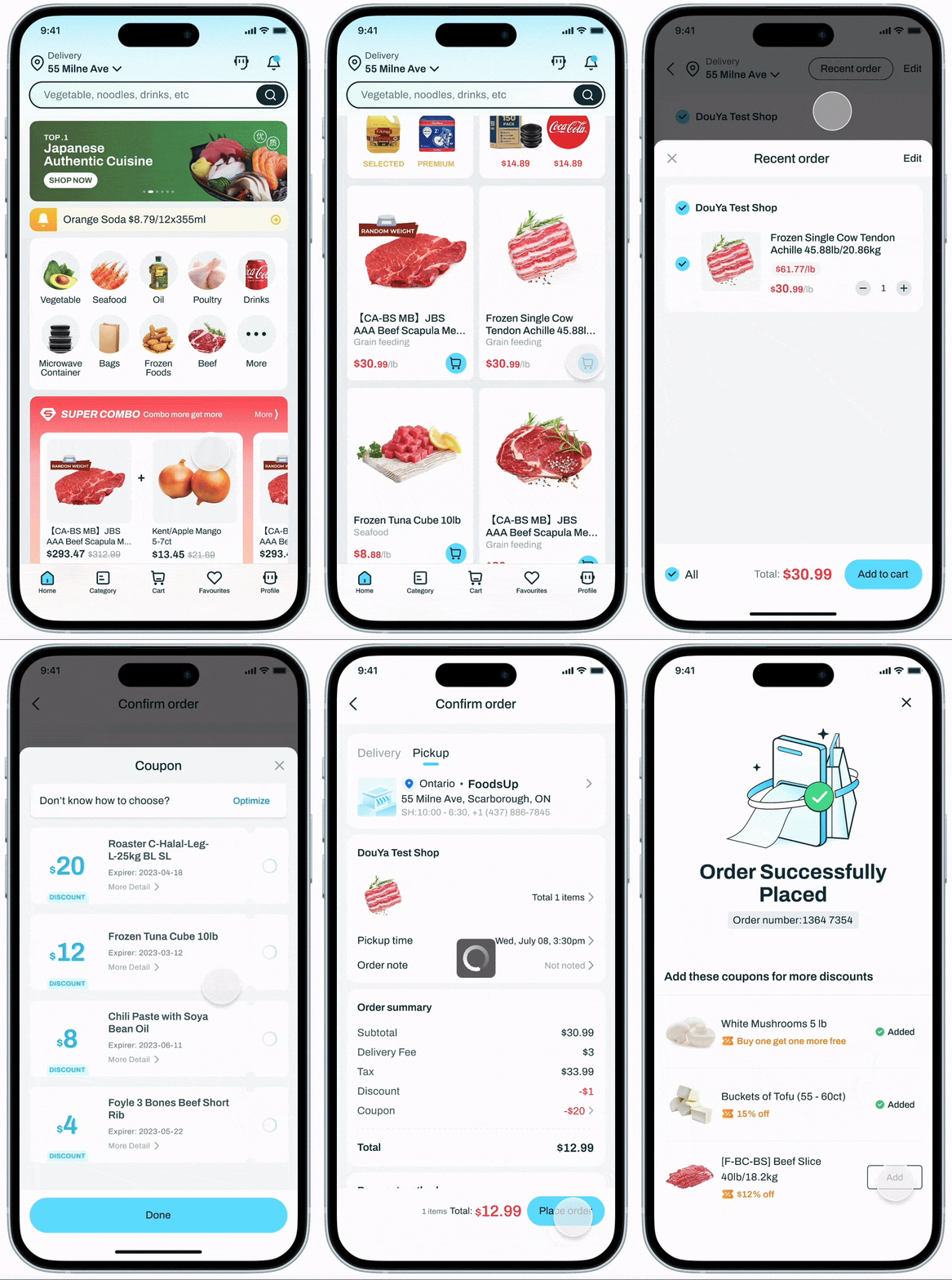
Place order
Improvment
  • Added discount info notification bar, few visually appealing promotions sale sections, personalized product recommendation to improve visibility of discount and promotion within the app.
  • Enhanced the user purchase experience by adding recent order and automatic discount apply functionality.
GIF_placeorder
demo_placeorder
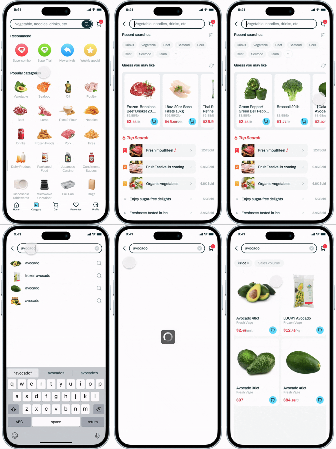
Search product
Improvment
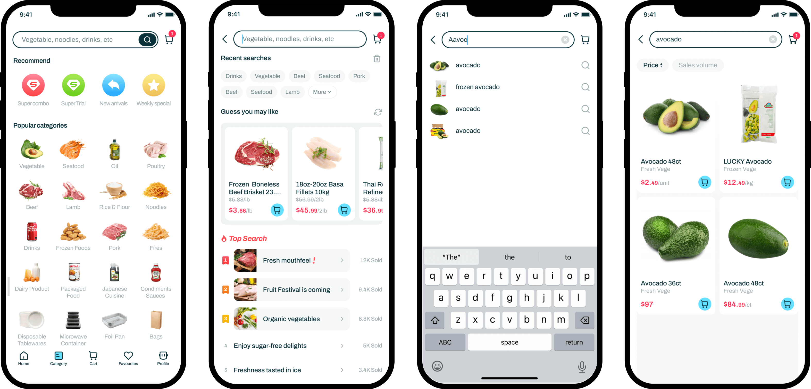
  • Added a recommendation section to help users select preferred promotions and redesigned the popular categories to enhance quick and intuitive product selection.
  • Under the search state, I added "Guess You May Like" and "Top Search" sections. These features enable users to quickly access popular or frequently searched items, making it easier to find what they need without having to type each time.
GIF_placeorder
Search_product
login/signup
Improvment
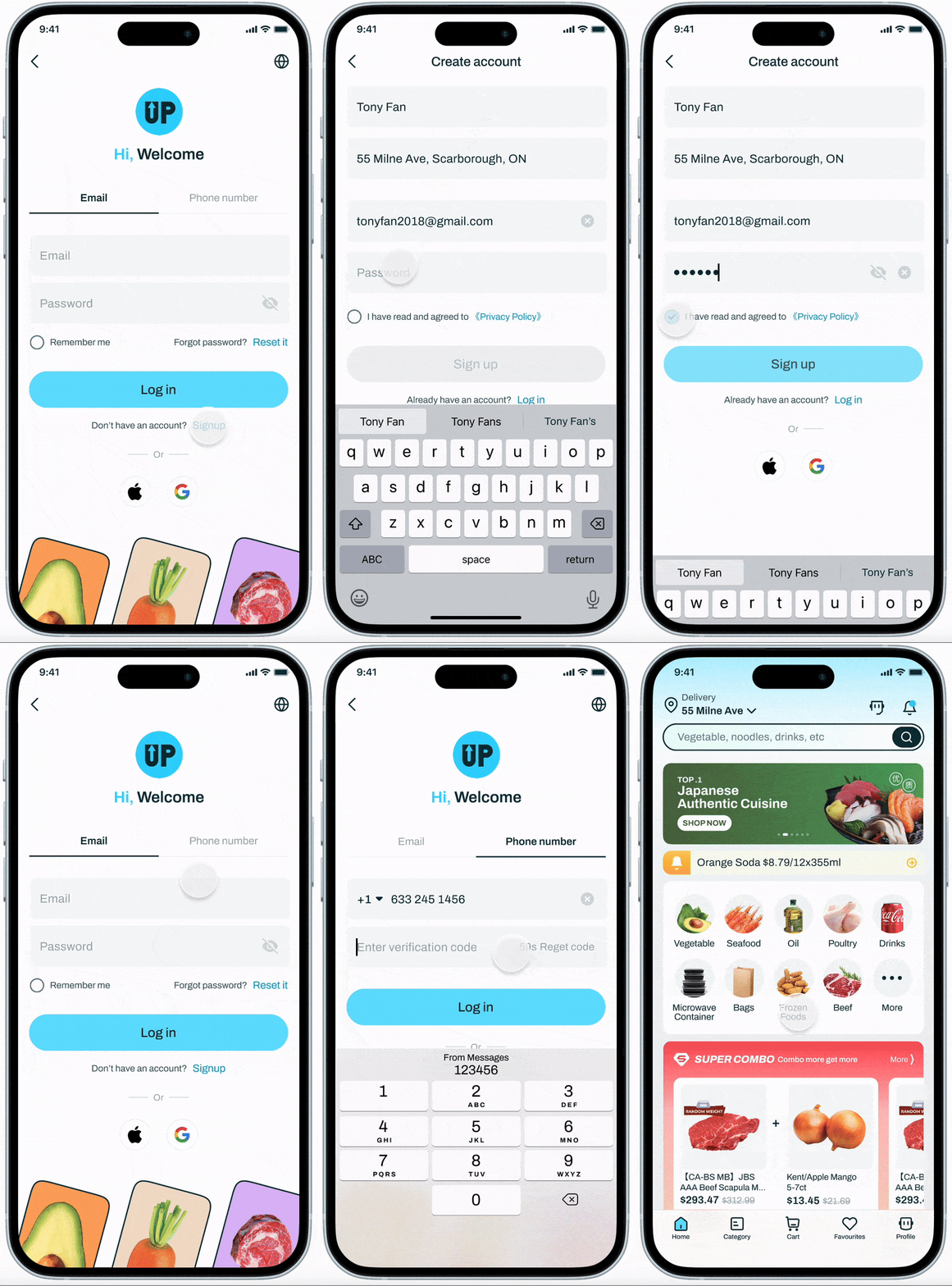
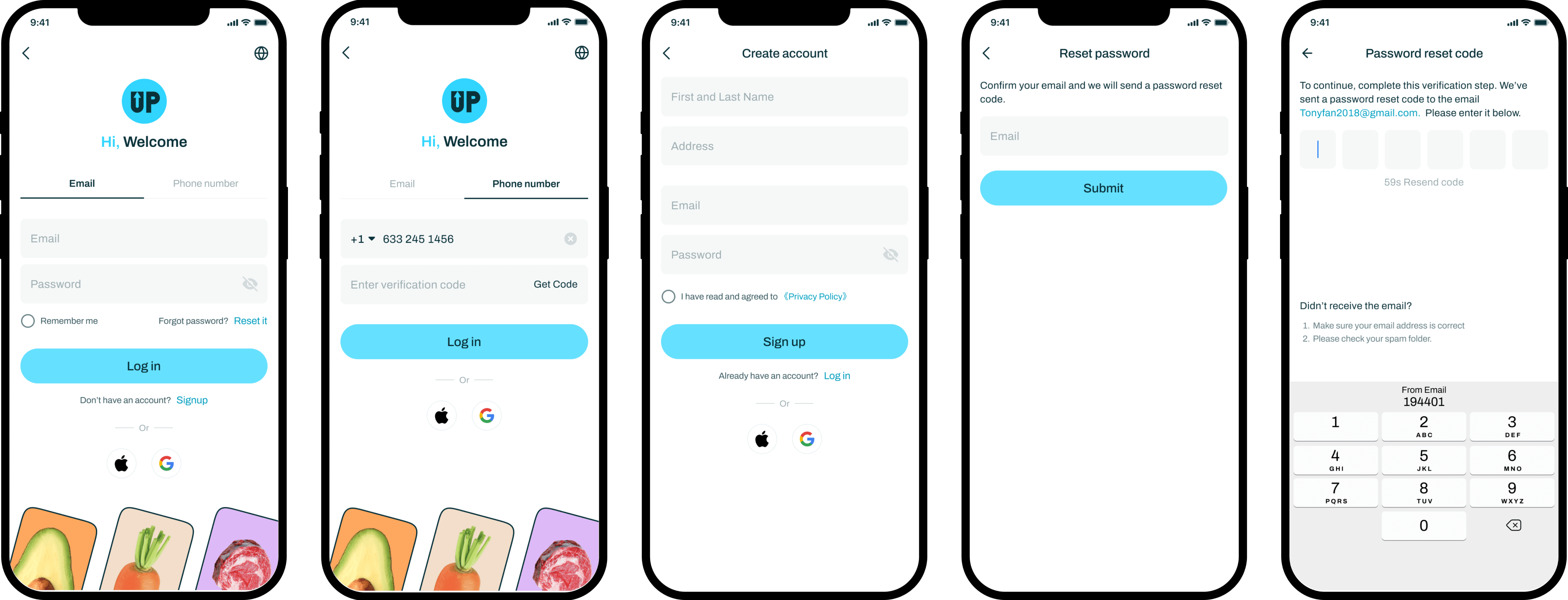
  • To enhance the user login experience, I added Email, Google login methods and optimize Phone Login process.
GIF_placeorder
login_signup
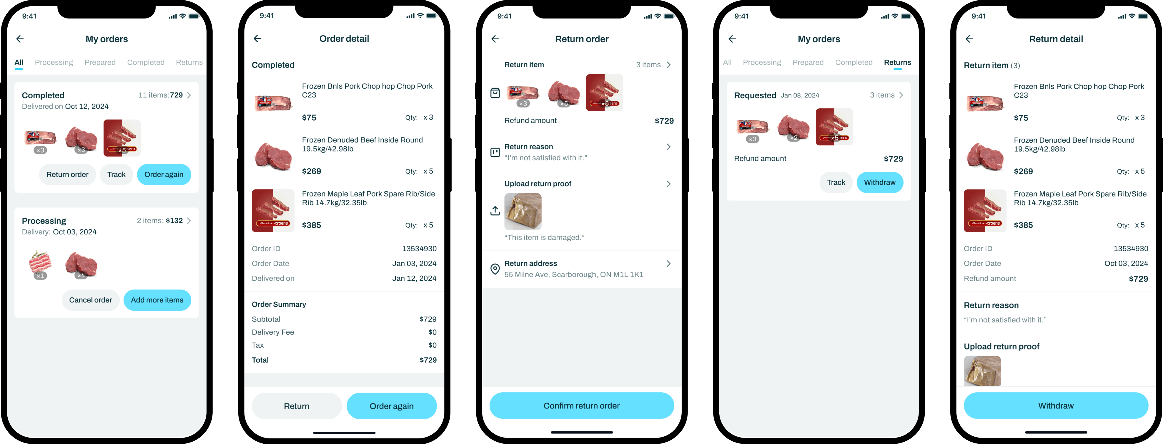
Return order
Improvment
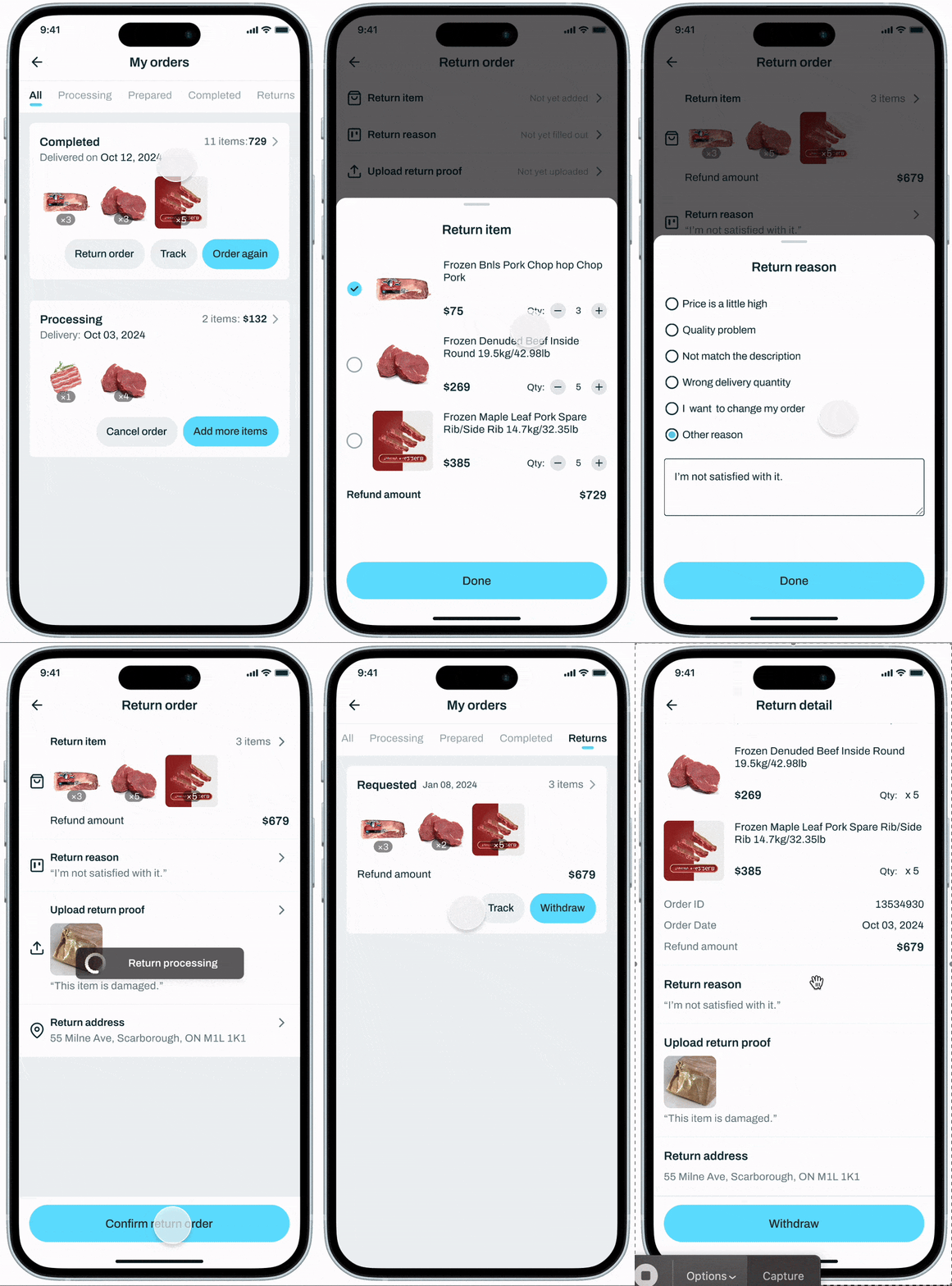
  • Based on user feedback and requirements from the customer service team, we designed a streamlined return process to improve user experience and reduce the customer complaint rate.
GIF_placeorder
return_order
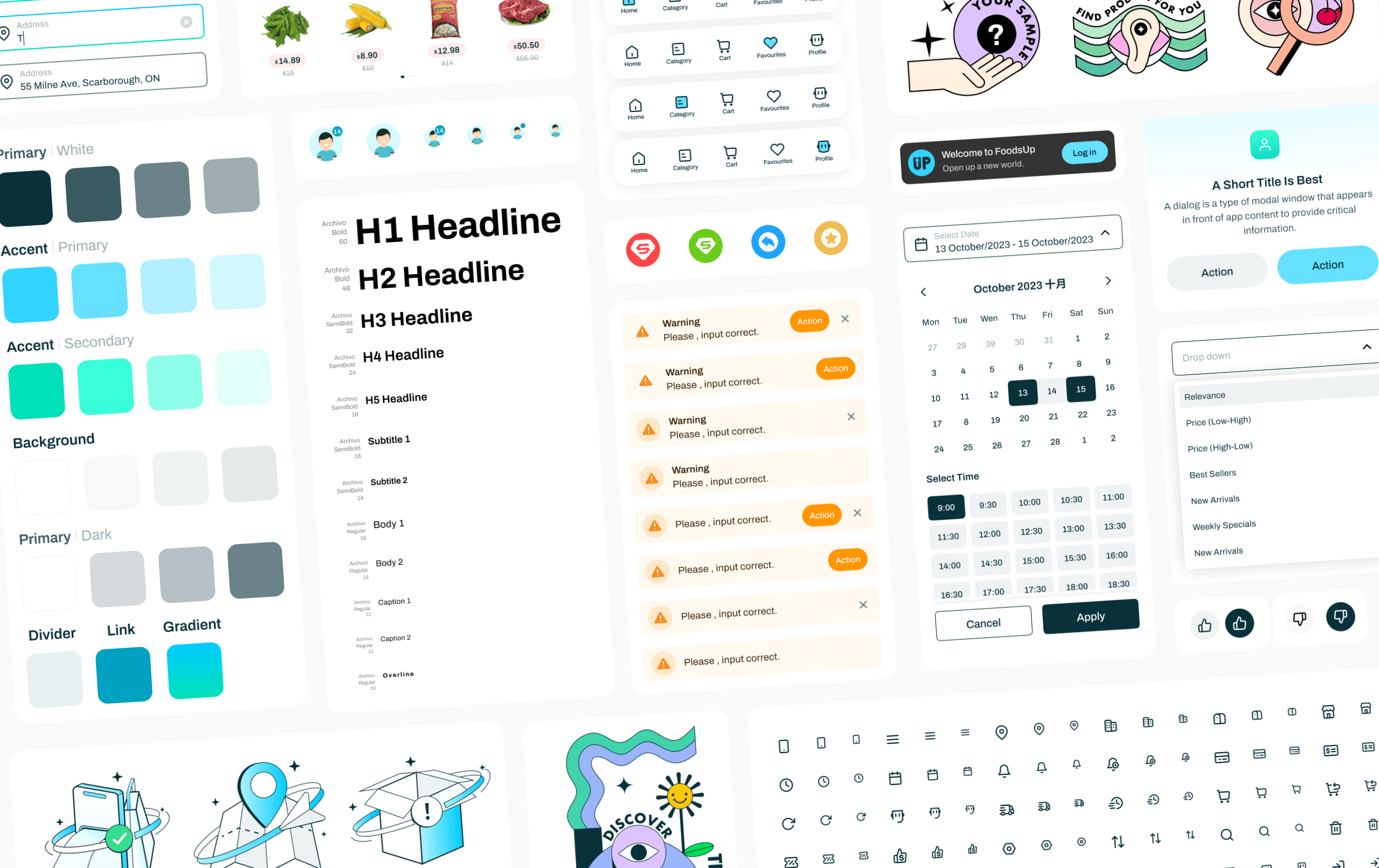
Design System
We created a Design system → for a consistent visual language and user experience.
It streamlines the design process by providing reusable elements and guidelines, saving time and allowing for easier scalability and updates.
design_system
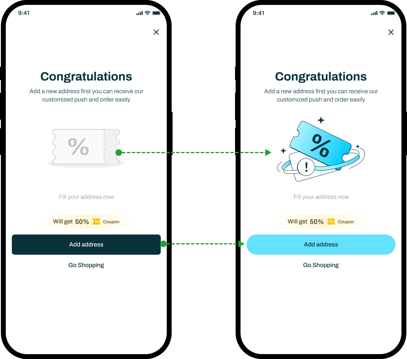
UI component iteration during hi-fidelity revisions
iteration_design_system
Changed sharp corner buttons to round corners
We aim to introduce a new button style with round corners to improve user engagement by making the interface more friendly and less intimidating.
Redesigned the empty state icon
create a more pleasant and memorable user experience, fostering a stronger emotional connection with the product and enhancing brand identity.
OUtCOME
Challenge
During prototype usability testing, collecting the specific user feedback we needed was challenging, as users sometimes struggled with understanding the prototype's limitations or didn’t fully engage with the test scenarios.
Solution
To ensure we collected meaningful feedback during prototype usability testing, we took several specific steps to provide clearer instructions and more guided tasks for users.
First, we restructured the testing script to include step-by-step guidance, breaking down complex tasks into smaller, more manageable actions. For example, instead of asking users to "complete the checkout process," we provided detailed prompts like "select a payment method" or "apply a discount code," guiding them through each part of the process.
Learning
I learned the importance of clear communication and structured guidance in getting valuable user feedback. By providing detailed instructions and breaking down tasks, we improved the quality of the feedback. I also realized that setting clear expectations helps users focus on what we want to evaluate.
This experience highlighted the need for careful planning to ensure the feedback is actionable and useful for refining the design.
View more