e-gift solution SaaS plateform
It helps offline merchants create customized digital
Vouchers and Coupons
Goal statement
Building a website that is both high-quality and user-friendly, while effectively showcasing the features, functions, and benefits of PREKA and encouraging users to consult and purchase our services.
Impact and results
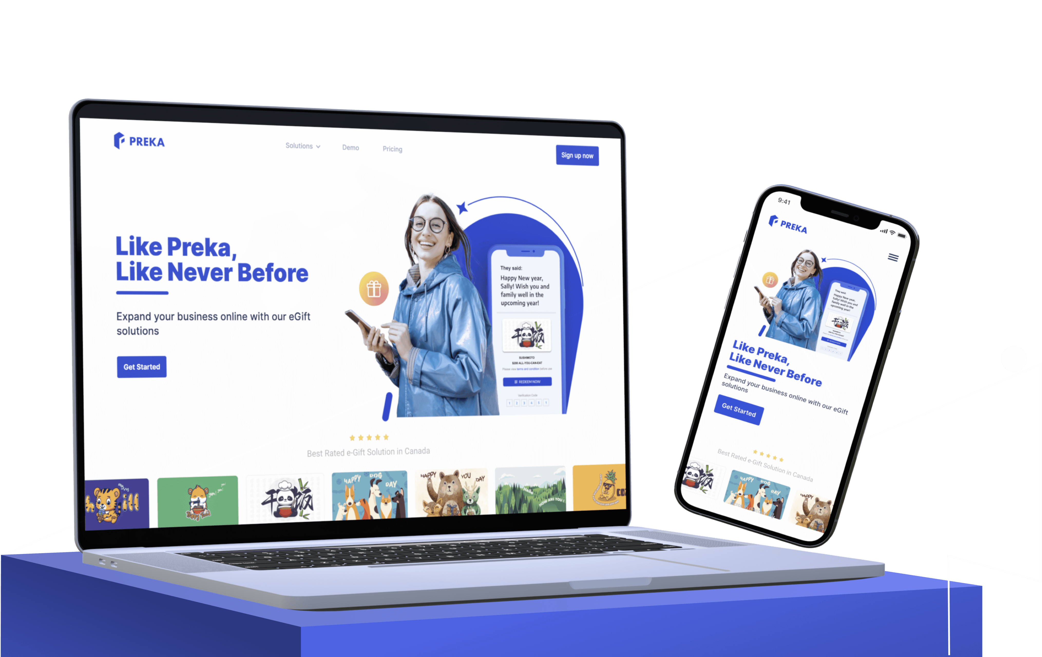
I created a responsive official website for PREKA, which increased the exposure rate of product by 45%, conversion rate 25%.
Ideation
I interviewed some of our clients why they purchased our product, and what kind of things they were looking for when searching for a eGift solution software. Our user friendly and aesthetically pleasing interface is one of the selling points. Based on the feedback, our website design will reflect on those points, both from the content and visual style.
design
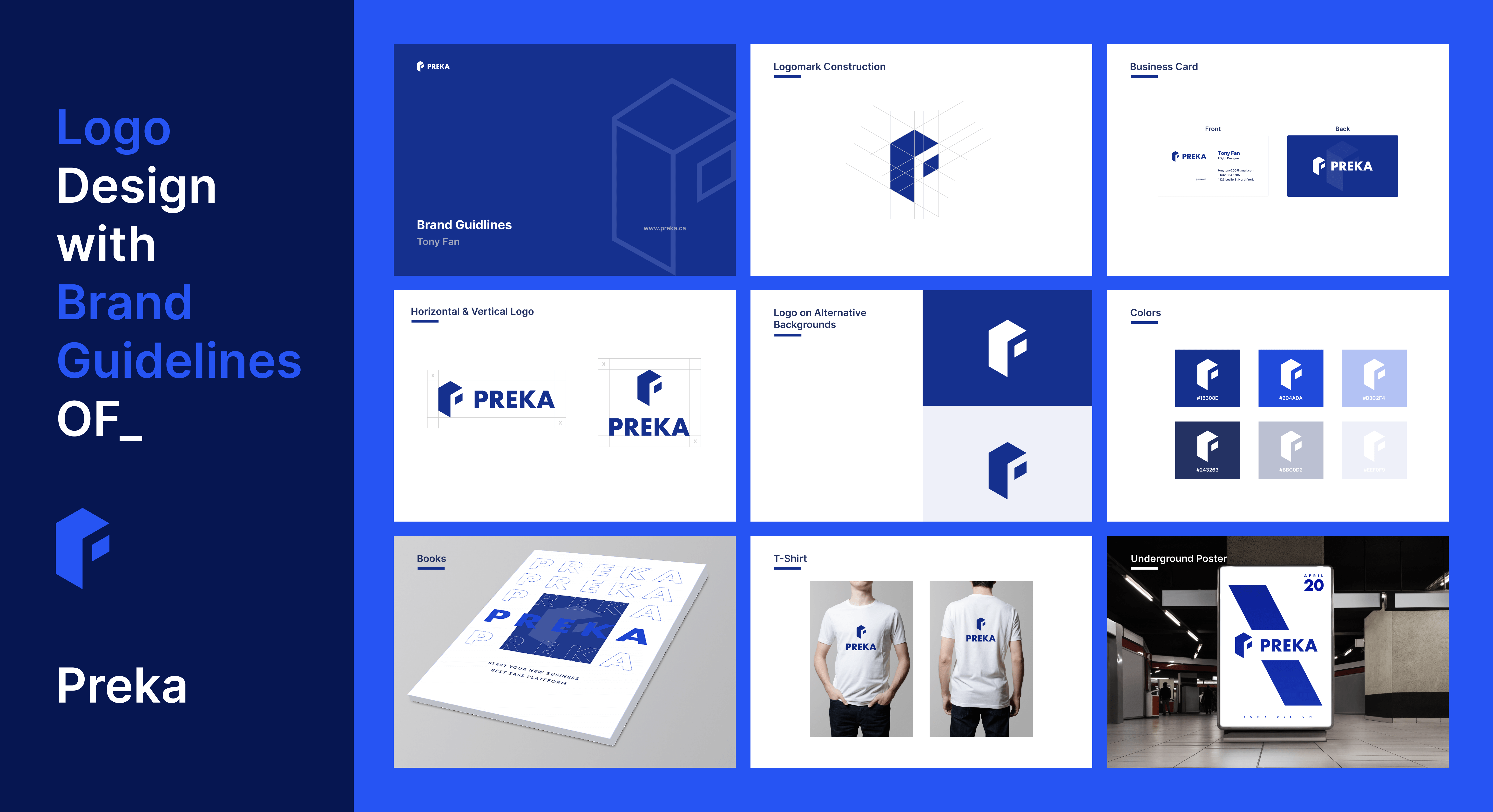
Brand identity guideline
Designing a brand identity guideline is an essential step in establishing a strong and consistent brand image. It outlines the rules and specifications for how a brand should be presented across various platforms, ensuring that all visual elements are cohesive and aligned with the brand's values and messaging.
design
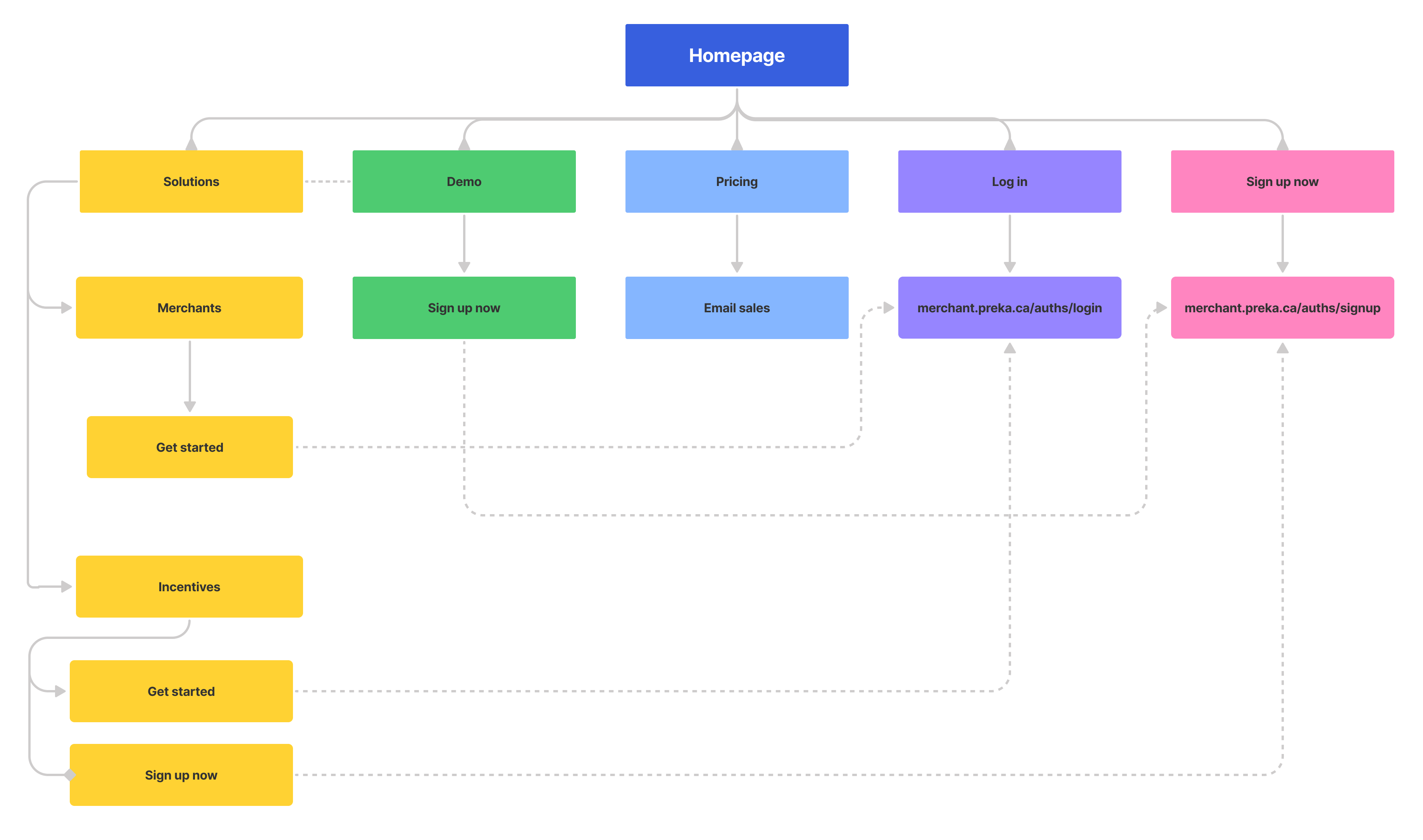
Site map
In order to help organize the content and ensure that the website is user-friendly and easy to navigate, site map is critical step need to be created before build website.
design
Evaluate design
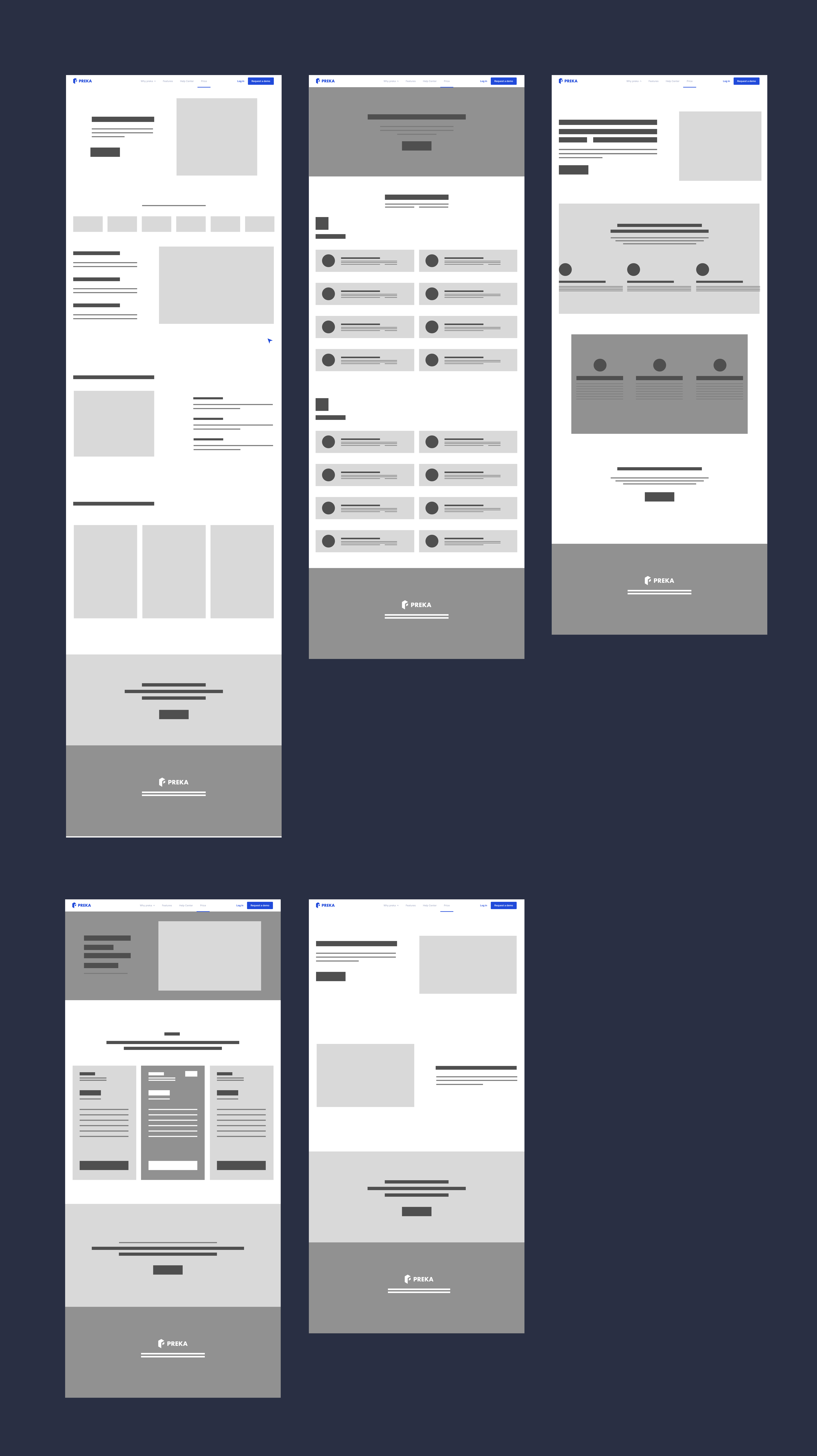
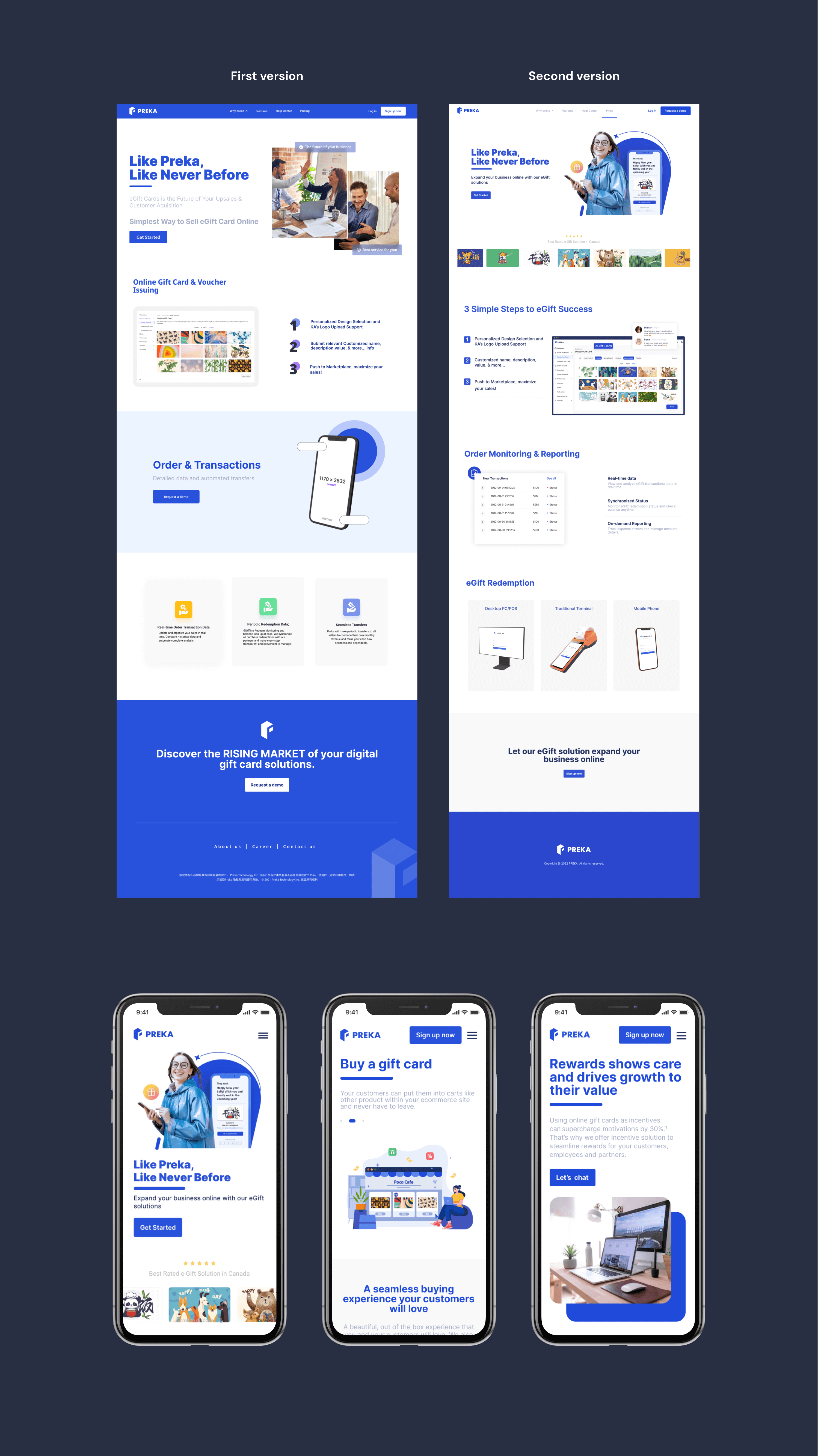
I designed two different versions of landing pages, the main golf is to determine which one performs better. This goal could be anything from increasing conversions or click-through rates to improving user engagement or reducing bounce rates.
First version, I used a images of business collaboration to convey that offline merchants business are consulting services of PREKA and our team member demonstrate how to use our product.
The second version showed customer is sending digital gift card through PREKA. In addition, this image shows the wide selection of gift card styles and highlighting the various options available for clients.
After conducting A/B testing with external users and internal stakeholders, they found that the second version had more compelling visuals and effectively highlighted product usage scenarios. It was also easier to understand and captured people's attention.
develop
Establish
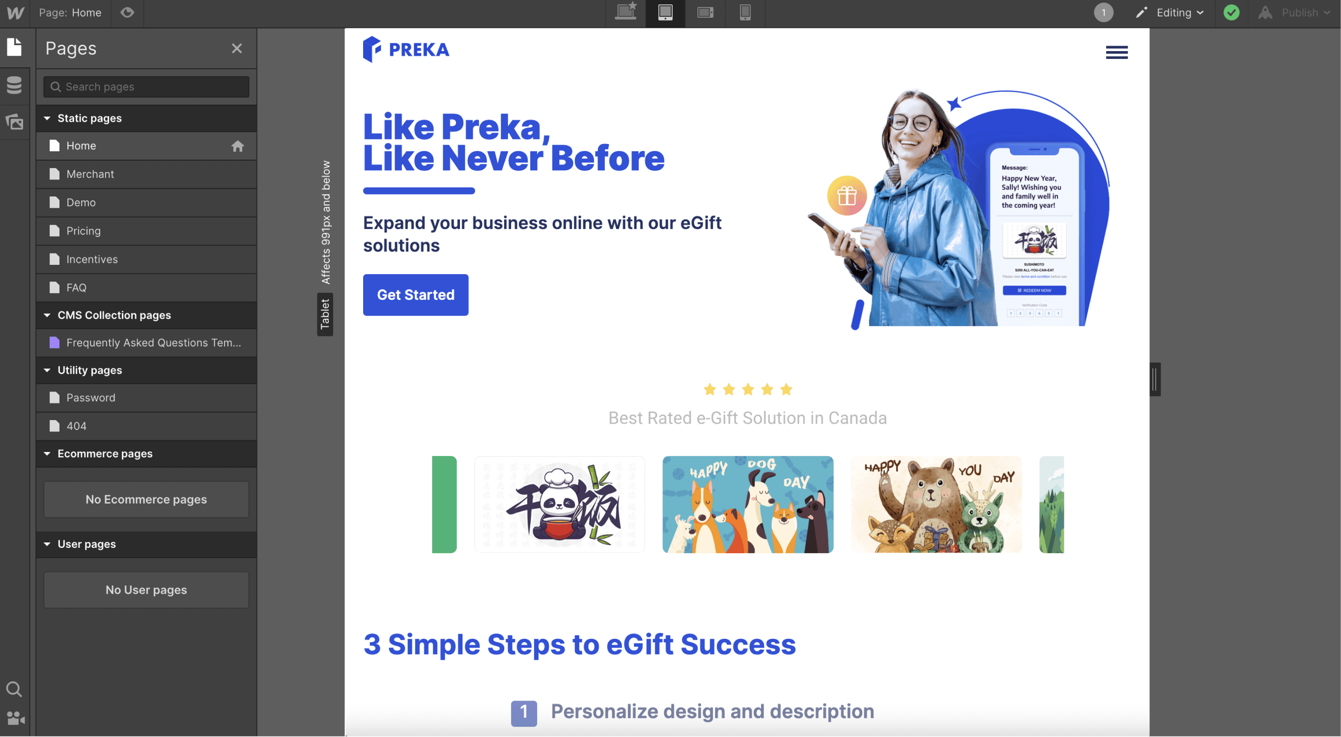
During a busy product development period, our team found ourselves short on developers to build a website . However, it is urgent that we need a website to showcase our product, and I volunteered to create it since I have experience building websites with Webflow. Webflow is an effective online SaaS tool that can quickly convert visual design mocks into an actual website.
Key Learnings
I gained valuable experience in designing and writing content for a SaaS marketing website. For a marketing website like this, the content is definitely the key.
